Analysis📊

Preparations for data analysis

Load packages

library(tidyverse)
── Attaching core tidyverse packages ──────────────────────── tidyverse 2.0.0 ──
✔ dplyr     1.1.4     ✔ readr     2.1.5
✔ forcats   1.0.0     ✔ stringr   1.5.1
✔ ggplot2   3.5.2     ✔ tibble    3.3.0
✔ lubridate 1.9.4     ✔ tidyr     1.3.1
✔ purrr     1.1.0     
── Conflicts ────────────────────────────────────────── tidyverse_conflicts() ──
✖ dplyr::filter() masks stats::filter()
✖ dplyr::lag()    masks stats::lag()
ℹ Use the conflicted package (<http://conflicted.r-lib.org/>) to force all conflicts to become errors
library(ggplot2)
library(dplyr)
library(RColorBrewer)
library(plotly)

Attaching package: 'plotly'

The following object is masked from 'package:ggplot2':

    last_plot

The following object is masked from 'package:stats':

    filter

The following object is masked from 'package:graphics':

    layout
Import clean datasets

load("data/rent.RData") 
load("data/income.RData")

Q1: How have rents for small and medium-sized housing units in Hong Kong changed by year?

Step1: Further process data “rent_clean”

renta<-rent_clean|>
  filter(housetype==c('a_hk','a_kow','a_nt'))|>
  mutate(year=as.numeric(year))|> 
  # process "year" as numeric type to draw a line chart
  group_by(year)|>
  summarise(small=mean(rent)) 
# create data 'renta' to study how small-sized housing units' rent change by year
rentb<-rent_clean|>
  filter(housetype==c('b_hk','b_kow','b_nt'))|>
  mutate(year=as.numeric(year))|>
  # process "year" as numeric type to draw a line chart
  group_by(year)|>
  summarise(medium=mean(rent)) 
# create data 'rentb' to study how medium-sized housing units' rent change by year

Step2: Create data “rent_compare” to draw the line chart

rent_compare<- renta |>        #combine the rent of two sizes by year in one data
  inner_join(rentb, by = "year")|>
  pivot_longer(cols=2:3,
             names_to="housetype",
             values_to="rent")   
#edit wide data to a long one and use column 'housetype' to distinguish small and medium size.
glimpse(rent_compare) # check the dataset
Rows: 52
Columns: 3
$ year      <dbl> 0, 0, 1, 1, 2, 2, 3, 3, 4, 4, 5, 5, 6, 6, 7, 7, 8, 8, 9, 9, …
$ housetype <chr> "small", "medium", "small", "medium", "small", "medium", "sm…
$ rent      <dbl> 162.1667, 154.5833, 153.3333, 150.0556, 134.7500, 133.5833, …

Step3: Q1 visualization

p1<-rent_compare|>            
  ggplot(aes(x = year, y = rent, color = housetype)) + 
  geom_line() + 
  labs(title = "Rents of Small and Medium Private Residence by Year",
       x = "Year",
       y = "Rent")+
  scale_color_manual(     
  # change the color for different lines, AI helped(Gitcode)
    name="House Size",
    values=brewer.pal(11, 'RdGy')[c(3, 1)]
  )+
  theme_minimal() + 
  # adjust the font and positioning of text in the table for improved visual appeal,referencing to code in the sample project(If the same code appears below, the explanation is the same as above)
  theme(plot.title = element_text(face = "bold", 
                              size = 12, 
                              hjust = 0.5),
        axis.title.x = element_text(face = "bold",
                                    size = 10,
                                    margin = margin(t = 10)),
        axis.title.y = element_text(face = "bold",
                                    size = 10,
                                    margin = margin(r = 10)),
        plot.caption = element_text(margin = margin(t = 10)),) +
 geom_point() 
library(plotly) # make the line chart interactive
p2 <- ggplotly(p1)
p2
library(htmlwidgets) # save the interactive chart in order to insert it
saveWidget(p2, file = "out/p2.html")

Q2: How rental pressures differ across age groups?

Step1: Create a column representing mental pressure

rent_clean|>  
  filter(year==25)|>
  summarise(recent_rent=mean(rent)) # calculate the recent average rent
# A tibble: 1 × 1
  recent_rent
        <dbl>
1        389.
pressure_clean<-income_clean |>
  filter(!is.na(age))|>
  group_by(age) |>  
  # divide income into different age groups
  summarise(avg_income = mean(income,na.rm=TRUE)) |>
  # calculate average income in each age group
  mutate(pressure=389/avg_income*1000)

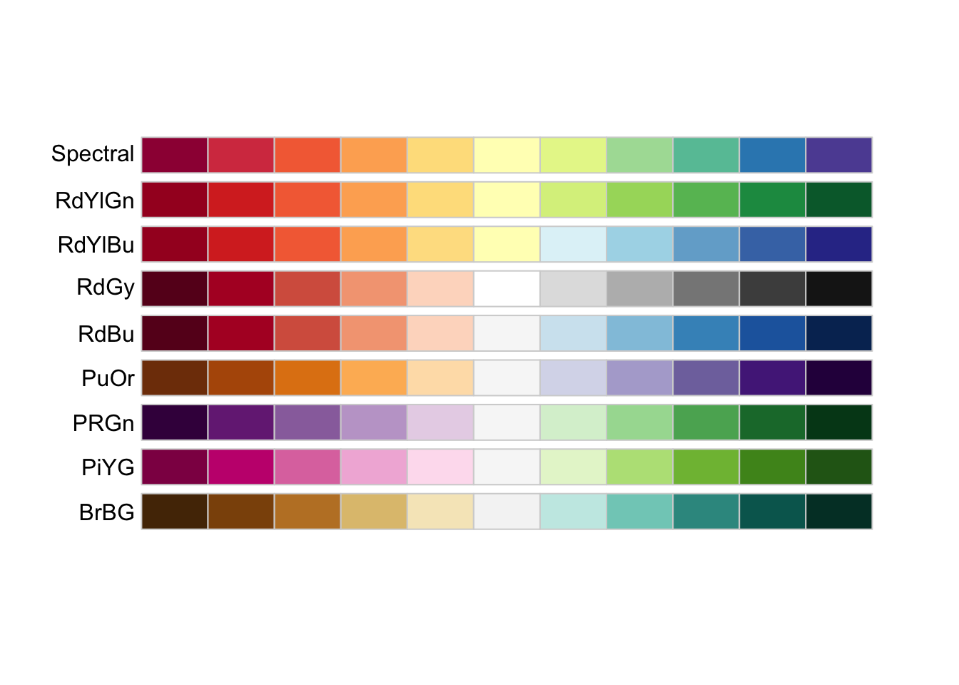
Step2: Choose colors

display.brewer.all(type="div") # glimpse and choose colors for the bar chart

Step3: Q2 visualization

pressure_clean
# A tibble: 6 × 3
  age         avg_income pressure
  <chr>            <dbl>    <dbl>
1 15-24            9666.     40.2
2 25-34           14139.     27.5
3 35-44           15971.     24.4
4 45-54           14334.     27.1
5 55-59           12393.     31.4
6 60_and_over      9648.     40.3
p5<-ggplot(aes(x = age, y = pressure, fill=age), data=pressure_clean) +     
  scale_fill_manual(           
    # fill colors in a palette, using Gitcode information
    name="Age Group",
    values=brewer.pal(11, 'RdGy')[c(1, 3, 5,7,9,11)]  
  )+
  labs(title = "Rental Pressure across Different Age Groups",
       x = "Age",
       y = "Rental Pressure")+
  theme_minimal() +
  theme(plot.title = element_text(face = "bold", 
                              size = 12, 
                              hjust = 0.5),
        axis.title.x = element_text(face = "bold",
                                    size = 10,
                                    margin = margin(t = 10)),
        axis.title.y = element_text(face = "bold",
                                    size = 10,
                                    margin = margin(r = 10)),
        plot.caption = element_text(margin = margin(t = 10)),) +
 geom_col(width = 0.5)
# 保存当前显示的图表为PNG
ggsave(
  filename = "images/rental_pressure_by_age.png",  # 保存路径+文件名
  plot = p5,  # 获取最后生成的图表
  width = 8, height = 6,  # 与当前显示尺寸一致(可根据需要调整)
  dpi = 300,  # 高清分辨率
  device = "png"  # 指定格式为PNG
)

Q3: What is the relationship between rent in Hong Kong’s three regions and the income?

Step1: Preparations for making a scatter plot with regression line

income_chart<-income_clean|> # summarise the average annual income
  group_by(year)|>
  summarise(avg_income=mean(income,na.rm = TRUE))
rent_chart<-rent_clean|>    
  # summarize the average annual rent for each type of housing unit
  group_by(year,housetype)|>
  summarise(avg_rent=mean(rent))
`summarise()` has grouped output by 'year'. You can override using the
`.groups` argument.
df <- rent_chart |>
  inner_join(income_chart, by = "year") # merge two datasets

# scatter plot with regression line
p6<-ggplot(df, aes(x = avg_income, y = avg_rent)) + 
  geom_point(
    aes(size = year, color = housetype)
    ) +
  scale_color_manual(
    name="House Type",
    values=c("#990000", "#CC0000", "#FF4D4D", "#FF8080", "#FFB3B3", "#FFE6E6")
  )+
  geom_smooth(method = "lm",       # plot a regression line
              se = FALSE, 
              color = "brown") +
  labs(x = "Average Income",       # label the chart
       y = "Average Rent",
       title = "HK Income yearly vs HK Rent yearly, 2000-2025",
       caption = "Source: Data.Gov.HK & HK Government Statistics Office | Author: Gao Xiangze") +
  theme_minimal() +
  theme(plot.title = element_text(face = "bold", 
                              size = 12, 
                              hjust = 0.5),
        axis.title.x = element_text(face = "bold",
                                    size = 10,
                                    margin = margin(t = 10)),
        axis.title.y = element_text(face = "bold",
                                    size = 10,
                                    margin = margin(r = 10)),
        plot.caption = element_text(margin = margin(t = 10)),) 
# (referenced to sample projects)
# AI helped a little to save as .png
ggsave(
  filename = "images/hk_income_rent_plot.png",  
  plot = p6, 
  width = 8, height = 6,  
  dpi = 300, 
  device = "png" 
)
Warning: Using size for a discrete variable is not advised.
`geom_smooth()` using formula = 'y ~ x'

Q4: How has rental pressures in Hong Kong’s three regions changed by years?

Step1: Q4 Visualization

p3<-df|>
  mutate(pressure=avg_rent/avg_income*1000)|>
  mutate(year=as.numeric(year))|>  
  # mutate 'year' into numeric type to draw the line chart
  ggplot(aes(x = year, y = pressure, color = housetype)) +
  geom_line() +
   scale_color_manual(
    name="House Type",
    values=c("#990000", "#CC0000", "#FF4D4D", "#FF8080", "#FFB3B3", "#FFE6E6")
  )+
  labs(x = "Year",
       y = "Reatal Pressure",
       title = "Trends in Hong Kong Rental Pressure, 2000-2025",
       caption = "Source: Data.Gov.HK & HK Government Statistics Office | Author: Gao Xiangze") +
  theme_minimal() +
  theme(plot.title = element_text(face = "bold", 
                              size = 12, 
                              hjust = 0.5),
        axis.title.x = element_text(face = "bold",
                                    size = 10,
                                    margin = margin(t = 10)),
        axis.title.y = element_text(face = "bold",
                                    size = 10,
                                    margin = margin(r = 10)),
        plot.caption = element_text(margin = margin(t = 10)),) +
  geom_point()

Step2: Make the chart interactive

library(plotly)
p4 <- ggplotly(p3)
p4
library(htmlwidgets)
saveWidget(p4, file = "out/p4.html")